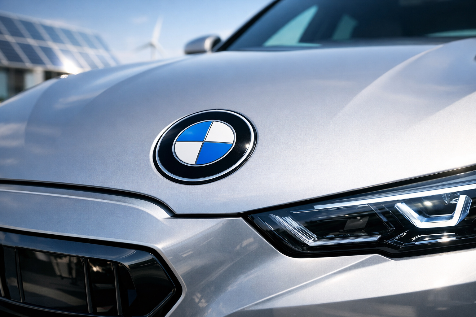
BMW didn’t redesign its logo with fireworks and a press conference; it quietly flattened it, like a designer whispering, “Trust me, it’s the future.” The BMW logo change matters because badges are car brands’ faces, and BMW just showed up with less makeup and more Instagram filter. If you care about BMW branding and electric car design, this subtle tweak tells you exactly where Munich thinks the next decade is headed.
I’ve driven dozens of BMWs from howling E46 M3s to the eerily silent iX, and this logo shift is the visual equivalent of that journey. It’s not about nostalgia; it’s about survival in an EV world where Tesla, Polestar, and Lucid all scream minimalism. The BMW logo change is small, but it’s BMW admitting the old rules don’t work anymore.
And yes, before the internet explodes, the roundel isn’t gone. The blue-and-white propeller still nods to aviation roots, but now it’s flatter, cleaner, and more digital-friendly. Think less Swiss watch, more iPhone icon.
BMW logo change: What Actually Changed
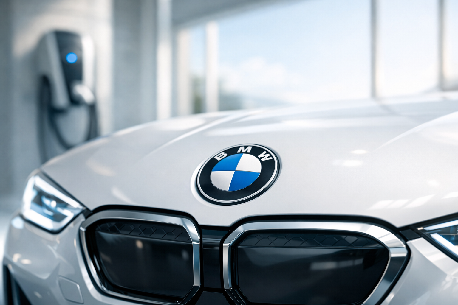
The headline tweak is transparency and flatness. BMW ditched the black outer ring on digital applications, leaving a white outline that floats like a HUD graphic. On physical cars, especially EVs like the i4 and iX, the logo appears cleaner, almost understated, which is either classy or boring depending on your caffeine intake.
This isn’t BMW being artsy for fun; it’s about screens. Logos now live on apps, charging screens, and Apple CarPlay-sized rectangles, not just hoods. A complex, shaded emblem looks as outdated on an iPhone as a CD changer.
Why EVs Force Branding to Grow Up
Electric cars murder traditional brand cues. No engine note, fewer grilles, and way less mechanical drama mean design has to do more heavy lifting. BMW branding now leans on minimalism because the car itself isn’t shouting through exhaust pipes anymore.
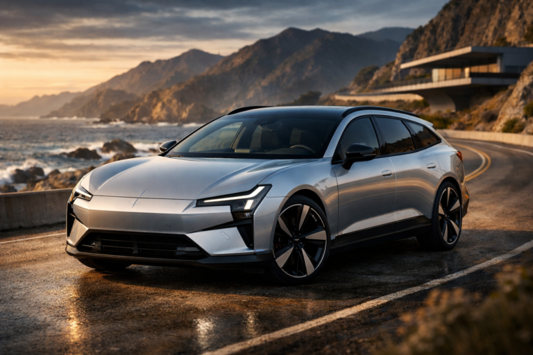
Look at Tesla’s stark “T,” Polestar’s origami cross, or Lucid’s spa-like typography. Compared to those, BMW’s old logo felt like it was still wearing a tie to a beach party. The BMW logo change is Munich loosening the knot.
This ties directly into what we’ve discussed in electric design changes reshaping brand identity. EVs flatten everything: torque curves, interiors, and yes, logos.
Competitors Are Doing the Same Thing (Quietly)
BMW isn’t alone in this minimalist retreat. Volkswagen flattened its logo in 2019, Nissan simplified its badge in 2020, and even Kia nuked decades of brand equity for a logo that still confuses rental car counters. Audi’s rings are practically allergic to shadows now.
If you want a deeper dive, our breakdown of the Audi One-Grille strategy shows how visual identity can either unify a lineup or blur it into corporate soup. BMW is trying to thread that needle without losing its soul.
The Controversial Take: This Is BMW Admitting EVs Are Appliances
Here’s the hot take that’ll annoy purists: this logo change is BMW admitting that, to most buyers, EVs are appliances first and emotional objects second. When your 2026 i5 does 0–60 mph in approximately 4.5 seconds but sounds like a dishwasher, branding shifts from passion to reassurance.
I don’t love that reality, but I understand it. BMW still sells M cars with 500+ horsepower and starting around $75,000, but the growth money is in calm, tech-forward EVs. Minimal logos make those buyers feel smart, not sentimental.
Does This Hurt BMW’s Performance Image?
Short answer: not yet. Long answer: only if BMW lets design laziness creep in elsewhere. A flat logo is fine; a flat driving experience is unforgivable.
Chris Harris has said repeatedly that feel matters more than filters, and he’s right. As long as BMW keeps steering feel sharper than a YouTube comment section and chassis balance intact, the logo can wear yoga pants for all I care.
BMW Branding vs the Luxury Trend Problem
This logo change also intersects with the broader luxury shift we’ve criticized before. Cars are getting pricier, quieter, and more tech-heavy, sometimes at the expense of character. If you’ve read what enthusiasts lose in the new luxury shift, you know the fear.
BMW branding now walks a tightrope: appeal to first-time EV buyers without alienating people who remember hydraulic steering. The logo alone won’t decide that, but it sets the tone.
What This Means for 2025–2026 BMW Buyers
If you’re shopping a 2025 or 2026 BMW, this logo won’t change your lease payment, which is starting around $55,000 for many EV models, check manufacturer website for latest pricing. It does signal that BMW sees itself more as a tech-forward mobility brand than a mechanical rebel.
That’s not inherently bad, but it puts pressure on BMW to deliver substance behind the style. A slick logo paired with laggy software is worse than no redesign at all.
BMW logo change: Smart Evolution or Corporate Shrug?
So is the BMW logo change brilliant or bland? I’d call it a smart evolution that risks becoming a corporate shrug if BMW doesn’t back it up with great cars. Branding can invite you in, but engineering makes you stay.
If BMW’s EVs continue to improve in range, driving feel, and usability, this logo will age like a good leather interior. If not, it’ll feel like the moment BMW blinked.
Pros
- Cleaner, more modern look for digital and EV platforms
- Aligns BMW branding with global minimalist trends
- Improves consistency across apps, screens, and vehicles
- Doesn’t erase BMW’s core roundel identity
Cons
- Risks feeling generic next to other minimalist brands
- Emotional connection weaker for long-time enthusiasts
- Signals a shift toward appliance-like EV perception
The BMW logo change won’t make your i4 faster or your iX charge quicker, but it tells a story about where BMW thinks the fight will be won. In the EV era, the loudest statement isn’t noise or chrome; it’s confidence. Whether BMW keeps earning that confidence is the real badge test.
For BMW’s own take, see the official BMW website, and for broader EV efficiency context, FuelEconomy.gov remains the reality check no branding team can Photoshop.